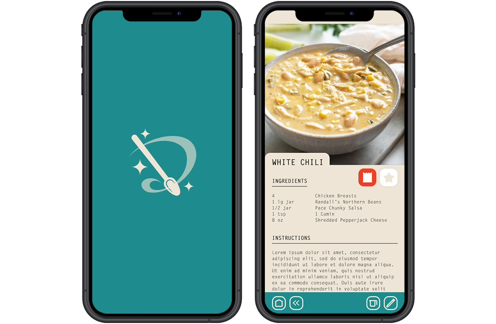
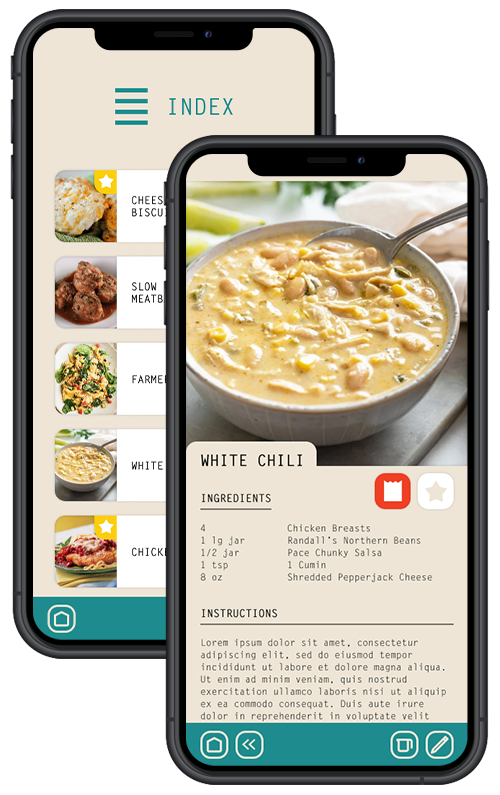
Originally, this was a project for one of my college courses. Since then I have revisited the project as a way to learn and practice Figma, while showing a bit of my creative growth.
(Plus I just really liked the project.)

The idea for this app came about when I realized just how much time my mother spent figuring out meals and grocery shopping. She would open her drawer of recipes, sort through the oodles of loose paper, pick a few, and go through each and write down all the ingredients that she needed to pick up at the grocery store. Often she would ask what we would like for dinner, to which we always responded "I don't know", which was less than helpful.
I decided to mock up an app to help make a busy parent's life as painless as possible... at least when they're planning meals.
There were three goals for the project:
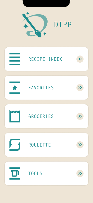
There are five main sections of the app - Index, Favorites, Groceries, Roulette, and Tools.
Index >>Where all available recipes are located.
Favorites >>The recipes a user and their family loves.
Groceries >>An extremely helpful list that cuts down on grocery shopping.
Roulette >>For indecisive kids, rainy days, or when a user wants to try something new.
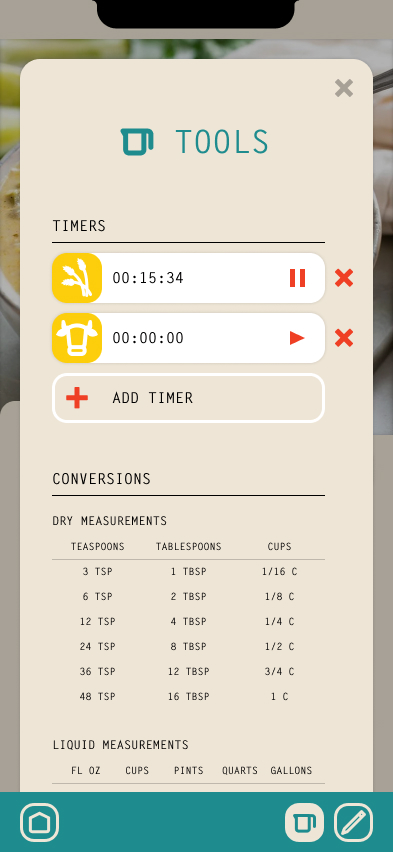
Tools >>Helpful tools to help a user while cooking.
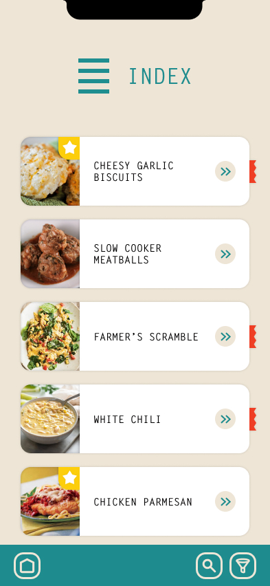
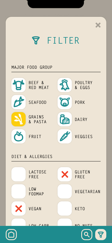
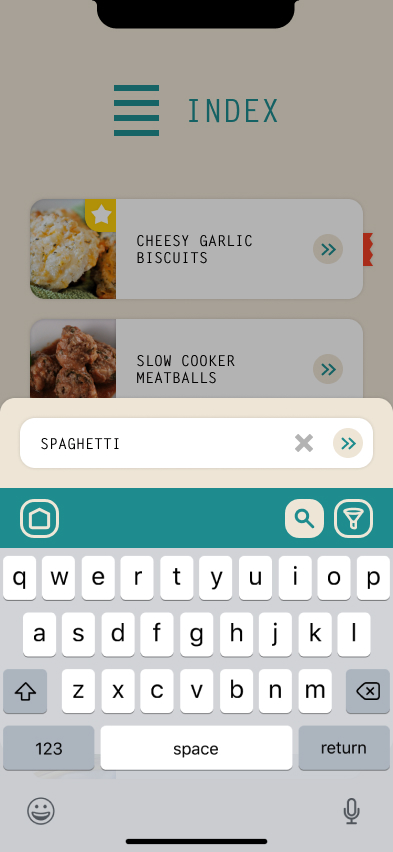
A scrollable list of all the recipes contained within the app. Favorite recipes are marked with a star, and recipes on your Groceries list are marked with a ribbon. Recipes can be filtered by major food group and diet restrictions, or with a search popup.
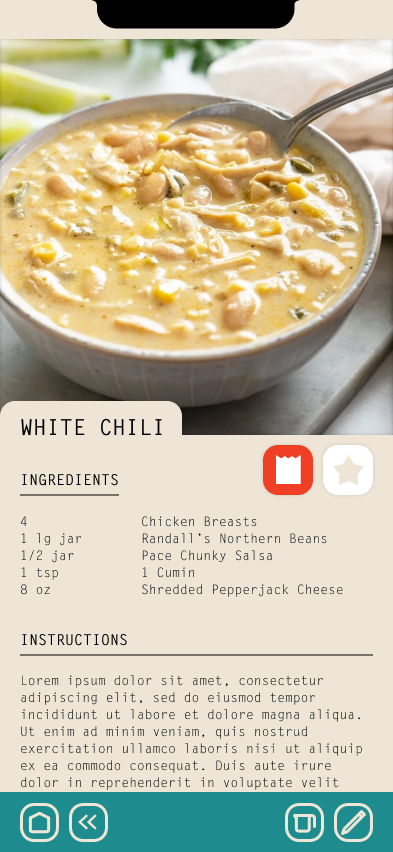
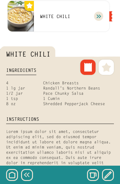
Displays the ingredients and cooking instructions for the selected recipe.
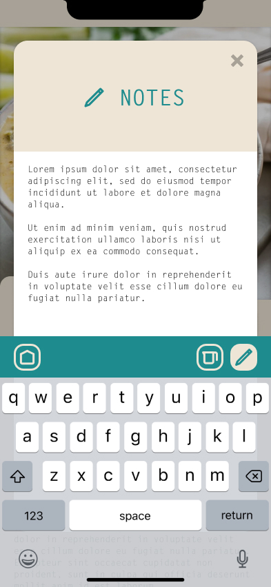
Users can add the recipe to their favorites list and/or their shopping list with the star and bag toggles. Notes can be added to each individual recipe for any customizations or experimentation.
There is also a toggle for a Tools popup that mimics the Tools section, where a user can set multiple timers and find helpful unit conversions without leaving the app.
The original scope of the project did not include a way to adjust the recipes directly, but that functionality would most likely end up in the final product, along with a way to add one's own family recipes.
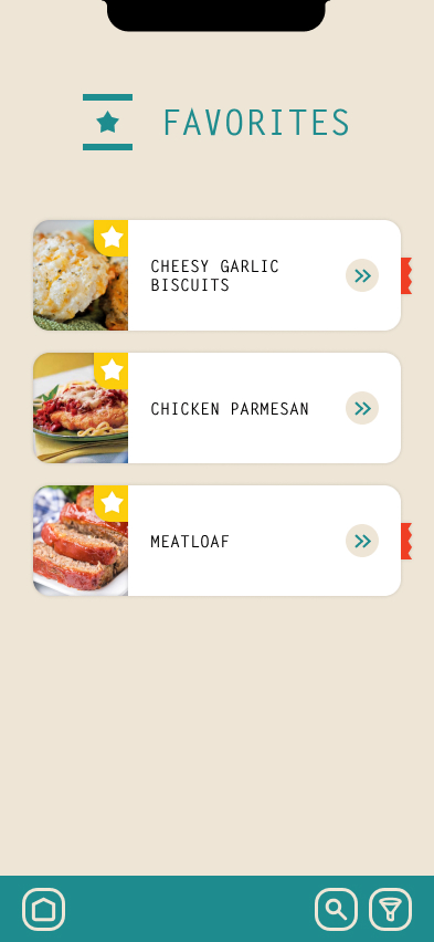
Displays a list of all the recipes that have been marked as a favorite, for when a user needs a tried and true recipe. This screen also has the same Filter and Search functionality as the Index screen.
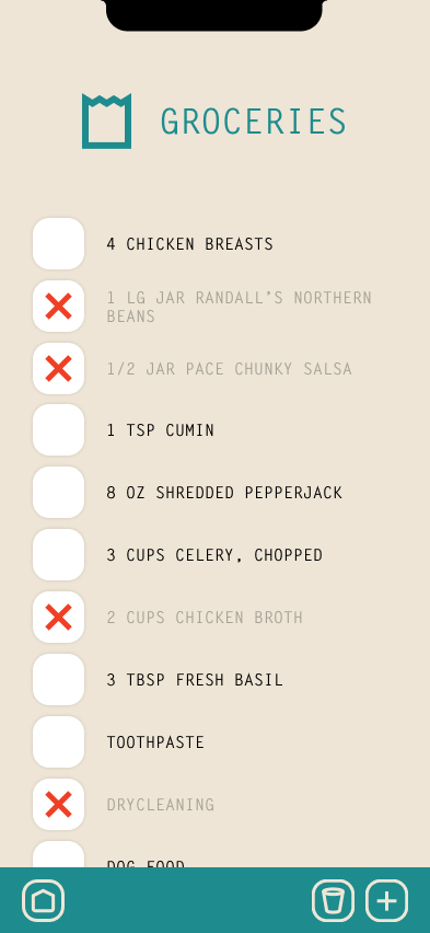
This sceen is probably the true powerhouse of this app concept.
When a user adds a recipe from the Index, Favorites or Roulette screens, the ingredients list will be copied straight to the Groceries list. The user can cross off items as they find what they need at the store, and they can add other grocery items or even errands that need to be completed while they're out of the house.
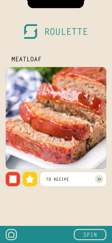
A simple random recipe generator for when a user is feeling spontaneous or indecisive. From this screen, the recipe can be added to Favorites or the Groceries list.
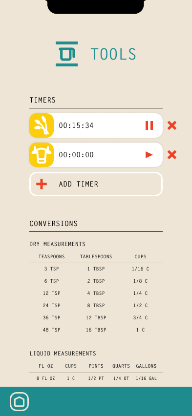
If a user is using a physical cook book, it's always handy to have an easy to reach timer or unit conversion.
This screen could use a larger update, but I decided to leave it true to the original for this relatively quick redesign. There's always room for improvement!
The previous version of this app design can be found below, for comparison.
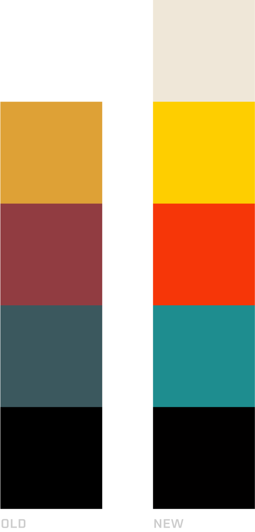
The initial concept used muddier colors to help give the app an old farmhouse feel, but I'm not sure I hit that mark. The muddy colors on stark white was certainly not doing me any favors.
For the updated design I used a more saturated teal, red, and yellow, with a cream color as a background to help with overall "farmhouse" feel.
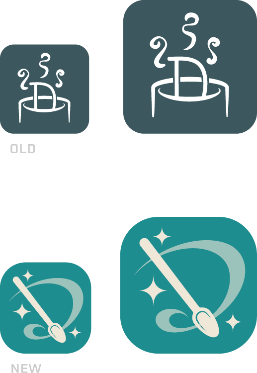
The original concept was clunky. I think the only excuse I have here is that I was still learning Illustrator.
I knew I wanted to incorporate the 'D' in the new design, but remove all that excess stuff. Swirling the spoon in a D-shape and a few retro star flares added the magic I was looking for.
I liked my original concepts, but they needed a bit of tweaking. The most notable changes to the category icons was a standardization of the icon width and height. I also removed that awful '?' from the Roulette page.
The food icons also got a bit of love - they were too cartoony and the food groups seemed too specific in some cases.
BACKGROUND: Mom has a small tin of index cards from her mother that are written up on index cards with a typewriter. They're worn and stained, but precious. I used those recipe cards as a jumping point for this redesign, and created a "card" system for the Index and Favorites pages.
I kept the original design's body font and got rid of whatever I was using for the headers. Adjusting the tracking on the headers and recipe names helps give that "typewriter" feel without leaning into it too heavily. On the Recipe pages, the title has been separated from the main body of the recipe to lean into that filing and index card system.
The final big design change was to get rid of all the harsh corners and round everything off to make it more of a friendly, warm feeling design.
myersj2014@gmail.com | Leave Feedback | LinkedIn | Resume